
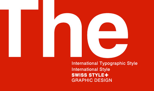
We know we’re in Haiti but, God bless the Swiss!!! The design world probably owes it to Switzerland for giving birth to the Swiss Style Graphic Design which gave the basis for our modern graphic design sense and how we perceive and use whitespace as designers.
But whitespace is more than just a design style that was attacked and defended in Switzerland. As often demonstrated in Whitespacelover, it’s a discipline. It’s everywhere and in everything we do. It’s the lull between melodies, the calm before a storm, the breath before an I love you too, the stillness in prayers and the silence that allows us to communicate. Whitespace is life!
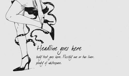
Even if you’re not a designer, you still live in a world of whitespace! Here are 10 evidences, tips and tricks on why you live in whitespace and how you can deliberately see and tap into it.
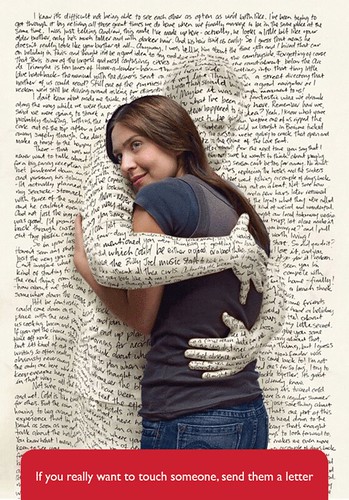
1. Whitespace is responsible for comprehension. The gap between spoken and written words are whitespaces. Without it this entry would look like a mush of letters on your screen. Or worst Kate Beckinsale’s sexy voice would sound like mosquitoes raping termites in your ears!
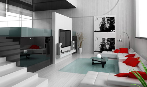
2. The more whitespace there is in your apartment the more spacious it will look and the more restful the environment will be. Not to mention that it will look better in photos. Try clearing unnecessary items or grouping them in a corner to create more space.
Ref: http://ow.ly/4VGqN

4. Your perception is greatly affected by whitespace. People tend to perceive something as elegant, classic or high-end in appearance when whitespace is mindfully applied in a design.

5. Whitespace is the ultimate something. What makes a Prestige bottle useful? It’s not the actual product we see but the empty space we can’t see that gives those brown bottles utility. Okay! A beer is useful too but don’t throw away your beer on Thirsty Thursdays for the sake of whitespace.

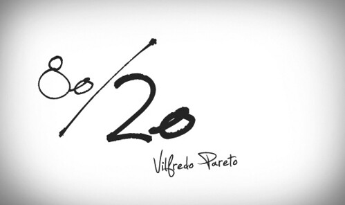
6. Essential designing principles such as “less is more” and Pareto’s Law, commonly known as 80-20 rule, are basically the wise use of whitespace.
7. If you want to design using the Swiss legacy, turn on the grid system in Photoshop (view>show>grid) and design like the Swiss Style Masters. Use ample gaps instead of separators to separate the elements in your layout.
8. A caution to designers. Amateur or clumsy use of whitespace could make a design look as if the graphic designer went lazy, resulting to an incomplete-looking work.

9. Apple, whether their designers are conscious or not, uses whitespace a lot in their OS interface, product design and ads. This naturally leads to an upscale image and a good end user result.

Ref: http://ow.ly/4VGuz
10. Design with whitespace in mind. Premeditate the space you’re given before starting to work. Our designers here at PubliGestion do it by roughly sketching a layout on a paper. They use shapes and lines to assign graphic elements their proper position in the layout.

No comments:
Post a Comment