Most of the graphic designers out there have a career path from print design to web design, which is comprehensible since chronologically, computers follow papers.
Of course, the ones who were born in the digital era form the exceptions; without a clue what in the world a "0.25in bleed" means. Don’t get us wrong; there are numerous graphic designers out there who know their stuff when it comes to print, billboard design, layout and the Pantone Matching System. BUT, all graphic designers are not good web designers - le contraire est aussi vrai. Web design is such a different world where there is no paper size; there’s "screen resolution", and it changes for every viewer depending on their screen size, colors don't cost extra to print, you have to use fonts that are included in most font-books, etc...
Transiting from print to web is a difficult journey for the graphic designer; just like the change from mac to windows. Though they share a lot of similarities, mostly on a fundamental level, print and web are two different worlds. The former is static (once it's printed, it's printed) while the latter is dynamic and most importantly interactive. Oh, and in print design, the paper doesn't have to load, whereas in web-design you're only as good as your website is light.
What's more is that it has *kinda* been proven that print designers and web-designers think with different sides of their brains. Which do you think is more creative? Either way, designers in general are some of the most passionate, strong willed, dedicated of people. We're always impressed with good design!
Oh, btw, we're hiring graphic designers if you need a job! It's a down economy, move to Haiti. ;-)
Designing is like life. No? You brainstorm, you plan then make things happen. Pretty much the same. But designing, like life, has its way of leaving you in a dike, bound with USB cables, gagged with JOs, your arse lit on fire and with deadlines circling overhead like crazy vultures.
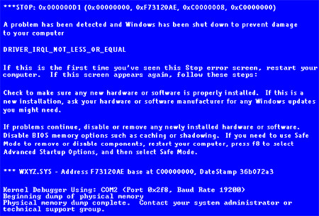
Like other designers, I’ve had my fair share of ball-breaking situations, and it feels like your PC just gave you "the blue screen of death, dumping physical memory now... 10.. 9.. 8... 7..." Feels hopeless. But if you ever find yourself in this kind of situation, I discovered that the only way to get out of it is to become a tank. This applies to everything else in designing (and in life). So, here are 4 ways on how to become a tank:
1. Never surrender. Never give up! To some this is translated to: "so long as there is coffee, we can work!" If you’re alive and can still wield a mouse, all awesomeness is on your side. You’ll be able to pull through things, just breathe.
2. You have friends, co-workers and people around you that are willing to help. Never underestimate, or neglect people. Whenever you feel the urge of surrendering, ask for help to accomplish your task.
3. Keep in mind that even a damaged tank is still armored and fully loaded. Always, use your strengths to your advantage. It is easier to build on strengths than on weaknesses. Weak skills when worked on will just become, at its best, mediocre skills.* For things you can’t do refer to Item#2.
4. If really pushed to the limits and all system shuts down. The only choice is to retreat. Refuel, recharge and live to do it all over again tomorrow. Have a nice meal, get some sleep and you’ll find that tomorrow will be a better day.
So when you’re stuck, do these and you’ll find that there’s always some fight left in you! Otherwise get yourself a nice glass, remove the tank top, distill rain from Venus and quietly weep.
If you like these tips, please leave comment below.
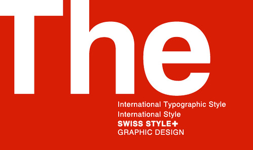
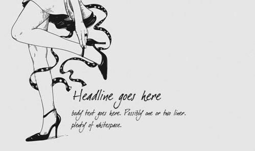
We know we’re in Haiti but, God bless the Swiss!!! The design world probably owes it to Switzerland for giving birth to the Swiss Style Graphic Design which gave the basis for our modern graphic design sense and how we perceive and use whitespace as designers.
But whitespace is more than just a design style that was attacked and defended in Switzerland. As often demonstrated in Whitespacelover, it’s a discipline. It’s everywhere and in everything we do. It’s the lull between melodies, the calm before a storm, the breath before an I love you too, the stillness in prayers and the silence that allows us to communicate. Whitespace is life!
Even if you’re not a designer, you still live in a world of whitespace! Here are 10 evidences, tips and tricks on why you live in whitespace and how you can deliberately see and tap into it.
1. Whitespace is responsible for comprehension. The gap between spoken and written words are whitespaces. Without it this entry would look like a mush of letters on your screen. Or worst Kate Beckinsale’s sexy voice would sound like mosquitoes raping termites in your ears!
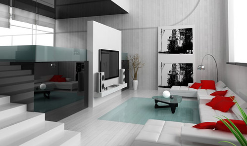
2. The more whitespace there is in your apartment the more spacious it will look and the more restful the environment will be. Not to mention that it will look better in photos. Try clearing unnecessary items or grouping them in a corner to create more space.
Ref: http://ow.ly/4VGqN
3. In Taoism The Void is the state of nothingness from which all things become. Incidentally, whitespace is the design element that allows all other design elements to exist. Hmmm, cult of the designers anyone?
4. Your perception is greatly affected by whitespace. People tend to perceive something as elegant, classic or high-end in appearance when whitespace is mindfully applied in a design.
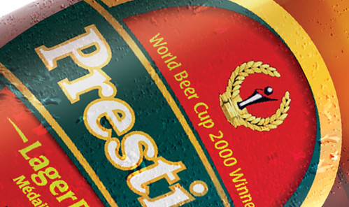
5. Whitespace is the ultimate something. What makes a Prestige bottle useful? It’s not the actual product we see but the empty space we can’t see that gives those brown bottles utility. Okay! A beer is useful too but don’t throw away your beer on Thirsty Thursdays for the sake of whitespace.
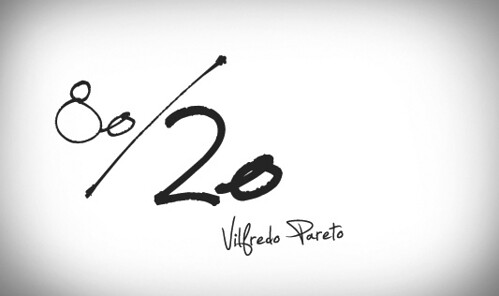
6. Essential designing principles such as “less is more” and Pareto’s Law, commonly known as 80-20 rule, are basically the wise use of whitespace.
7. If you want to design using the Swiss legacy, turn on the grid system in Photoshop (view>show>grid) and design like the Swiss Style Masters. Use ample gaps instead of separators to separate the elements in your layout.
8. A caution to designers. Amateur or clumsy use of whitespace could make a design look as if the graphic designer went lazy, resulting to an incomplete-looking work.
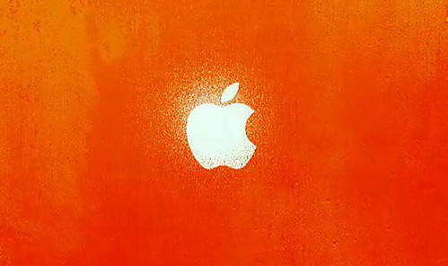
9. Apple, whether their designers are conscious or not, uses whitespace a lot in their OS interface, product design and ads. This naturally leads to an upscale image and a good end user result.
Ref: http://ow.ly/4VGuz
10. Design with whitespace in mind. Premeditate the space you’re given before starting to work. Our designers here at PubliGestion do it by roughly sketching a layout on a paper. They use shapes and lines to assign graphic elements their proper position in the layout.
PubliGestion Bloggers’ Block is a team of talented creatives, marketing personnel and UFOs blogging about their views, what’s new and some juicy bits about living in Haiti and in Outer Space!


